Anzisha
Brand Guidelines
Welcome to the Anzisha Brand Guidelines. This resource is your essential toolkit for communicating the Anzisha movement with consistency, clarity, and impact. Adhering to these guidelines ensures we speak with one powerful, unified voice, showcasing the spirit of African entrepreneurship, innovation, and leadership across all platforms.
Anzisha’s visual identity simplifies and sharpens the core elements of our brand to create a bold, effective, and forward-thinking design system. It’s not just a set of rules—it’s a framework that empowers creativity, consistency, and clarity.

Our Mission
To support and equip Africa’s young entrepreneurs with the knowledge, skills, and platforms they need to overcome systemic challenges, build sustainable businesses, and change Africa’s perceptions about youth entrepreneurship.
Accessibility
We are committed to designing with high contrast and legibility standards to ensure our brand is accessible to all users.
Brand Identity
This guide is for all stakeholders, including media, program participants, designers, agencies, printers, and journalists.

Logo Usage
The Anzisha logo is the primary symbol of our collective strength and purpose. The monogram is formed by multiple “A”s from the name Anzisha, which come together to represent the collective strength of the program and its community. It speaks to transformation, unity, and the ripple effect of empowerment.
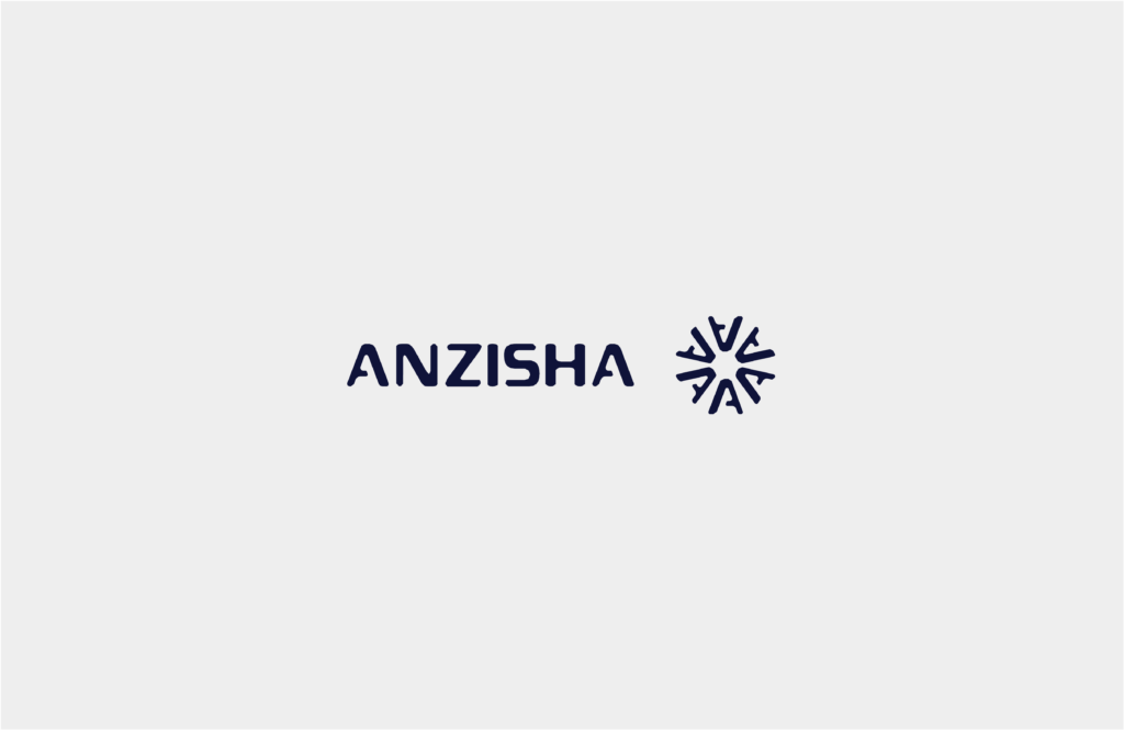
Logo Versions
Approved Versions and Specifications
Main Logo Horizontal lockup with
wordmark: Primary use for most materials.
Stacked Logo Vertical lockup for
constrained spaces: Use in social media headers or narrow columns.
Icon (Monogram) The ‘A’ monogram onl: Use as a favicon, social profile image,
or motion end-frame

Clear Space and Co-branding
Always maintain a mandatory clear space around the logo.
The space is determined by the height of a single capital “A” from the wordmark to
ensure maximum legibility.
Logo Colour
The logo must always appear in a single, unified colour. For maximum clarity, it should be displayed in solid white or beige over dark or photographic background

Logo Do’s
Use the logo on solid backgrounds for strong contrast.
Use the solid white version on all photography.
Adhere to co-branding principles when featuring partner logos.
Logo Don’ts
Never alter the colours, orientation, or proportion.
Do not use mixed or multiple colours; it must be a single colour.
Do not place the logo over busy or distracting images where it compromises legibility.

Brand Colours
Our colour palette is designed to unify our creative and establish the brand’s identifier.
Primary Palette
(The Core)
This palette is used for backgrounds, typography, and core graphic elements.

Typography
Our typography system is chosen for maximum readability and legibility while conveying a modern, assertive feel. The specific font names are not provided in the snippets, but the usage rules are key.


Download our brand assets
General Enquiries
Please reach out if you have questions regarding the application of these guidelines.
[email protected]